
Joomla 4 comes packed with features by the core version. One of these features is the Bootst6rap Framework, which Joomla has added by default.
Bootstrap has been around since 2011 and part of Joomla since version 3. The latest version, 5.1, is prebuilt into Joomla 4. When this is said, most of Joomla's core doesn't use it by default. Read more here about how to use it in a Subform.
Best features of Bootstrap:
Benefits of using Bootstrap
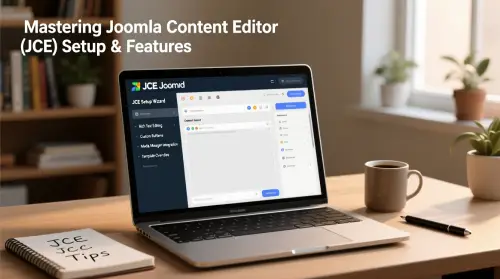
Bootstrap is a Framework that is known by developers to be easy to use and, at the same time, offer speed and maintainable code. Bootstrap is by default installed in Joomla 4, the version to this date is Bootstrap 5.1.3, but I believe it to become updated in future releases.
Colors
Using the standard colors in Bootstrap is very easy, these classes are as follow: .text-primary, .text-secondary, .text-success, .text-danger, .text-warning, .text-info, .text-light, .text-dark, .text-body, .text-muted, .text-white, .text-black-50, .text-white-50
Witch will show as follow: .text-primary, .text-secondary, .text-success, .text-danger, .text-warning, .text-info, .text-light, .text-dark, .text-body, .text-muted, .text-white, .text-black-50, .text-white-50
Cards
Cards are the modern way of displaying ranges of content that often fit together. Examples of use cases that use cards can be pricelists, news, and the site's footer. By default, cards are not responsive, but by using some easy CSS rules we can make them responsive.
Lists
We all use lists in web development, but the default bullet list looks awful and retro in my eyes. We can all style our asses off, but the lists will look the same. Bootstrap offers something better than the plan lists. By using .list-group as a class in the ul or ol element, and .list-group-item in the li element you get a better-styled list. See below:
- An item
- A second item
- A third item
- A fourth item
- And a fifth one
Display settings
In the display setting, you decide what to show on different displays like desktops, tablets, or phones. So based on the classes you have set in your content, you can manipulate how content is viewed on the devices. The predefined classes are: .d-sm-block, .d-md-block, .d-lg-block, .d-xl-block, and .d-xxl-block. These have these breakpoint sizes ≥576px, ≥768px, ≥992px, ≥1200px, and ≥1400px, you can read more about Breakpoints here. .d-none is used to hide all by default, which is why you always include the class .d-none first every time and the others after because it resets what is to be shown to nothing.
A combination of these is necessary to get the best result. These combinations can be: .d-none .d-md-block .d-xl-block, Wich means you only display it on specific screen sizes.
If you use it on your modules, you can control what is displayed on which devices. Usually, you set this under the Advanced tab and "Module Class", but for the menu module, you must put it in the "Menu Class" in the advanced tab. This means you should have more than one module to control when to show what.
Margins & Padding
Using padding and margins in Bootstrap is relatively easy to work with. By default, Bootstrap offers ranges from .25rem to 3rem. For margins you simply use "m-", and padding is done by "p-" represented by a number from 0-5, where 0 is no margin/padding. If you want to specify the sides, you use (m/p) t, b, s, e, x, or y, representing top, bottom, sides, left, left and right, or top and bottom. You can read the full explanation here.
MORE WILL COME LATER!

- LET ME KNOW IF YOU KNOW ANY OTHER WAYS TO DO THIS IN THE COMMENTS BELOW -


Add comment